Website Image Guide

Minimum Image Sizes

Each section with the option to upload an image (a "Browse" button) is designed so that images must meet a minimum image size to display correctly (or at all, in many cases).  This does not mean that you need to resize a larger photo down to this minimum size. In fact, we suggest using a photo larger than the minimum size so the focus tool will work properly. 


Resizing & Cropping Images

Before you attempt to alter any of your photos, it's important to understand the difference between resizing and cropping. Resizing changes the size of an image, but allows it to keep the same shape and height to width ratio, while cropping removes portions of the image and can change the size, shape, and height to width ratio. 
find resizing tools 

Photo Guidelines

Taking your own photo?

When a student, staff, faculty, or alumnus/alumna will be submitting a portrait photo, here are some recommendations to follow that will help you achieve the best possible image. The portrait should be well lit, in focus, and show the subject from the waist up with margins on the left, right, and top. The image should be uncropped and as high a resolution as possible (i.e., the original image) with a minimum size of 680x680 pixels. 

learn about photo guidelines

Images & Accessibility

Because images and graphics make content more pleasant and easier to understand for people with or without learning disabilities, we need to ensure that our images are accessible to everyone. They serve as cues for people with visual impairments to orient themselves in the content and are also helpful for those with cognitive and/or learning disabilities. Both images with text and images without alt text can negatively affect both your website and the user's experience in many ways. Not only do they cause problems for people with vision impairments, but also for people who are just trying to find information on your website.

learn more about images on text

Image Focus Tool

The Image Focus Tool is available for images that are added to website sections. It is a feature that allows you to 'shift' the photo so that a certain area is centered. This tool If you are using a photo that is only the minimum size, the focus tool won't have any room to make that shift. Using a larger than minimum photo will allow that focus tool a larger area to make that adjustment.

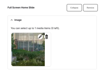
When you edit a section with an image, you will see a pencil icon and a trashcan icon.

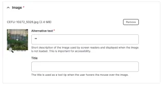
If you click the pencil icon, you will get a popup window with a small preview version of the image, an alternative text field, and a title field. You can click and drag the + in the image in order to set its focal point. 


Photos and Copyright

The complexities of intellectual property rights are best avoided by using original WashU photos. Even WashU images, if published in scientific journals, may be subject to a particular journal’s licensing restrictions. Do not use any images without first securing all necessary rights, permissions, and licensing agreements. Note that copyright law pertains differently to educational classroom use than it does to general distribution and publication. If you use open-source photos, take care to follow licensing conditions and give credit, following the CC best practices for attributing images.

learn about CC best practices for attributing images

Why are thumbnail and header images so important for articles and events?

Because they are everywhere!  The thumbnail header images you are uploading don't just live in its respective event or article.  You may think you don't need thumbnail and header images, but when it comes to content share, other people do!  When your content is shared to another site, they are unable to add a photo. This means that when they display your article or event on their side, it will only show the default ampersand image, which may discourage them from featuring it. Also, if you are hoping to have your content shared on the Artsci site or the Ampersand page, it is crucial to have a thumbnail photo.  It can be pulled into many other sections on your website:

Thumbnail Images: 

  • home page
  • multipurpose page
  • the grid view of your events or news landing page
  • recent news scroll at the bottom of a person profile
  • recent news scroll at the bottom of articles

Header Images:

  • top of individual events and articles
  • top of the home page when using an event or article header
  • top of the events and articles landing page when featuring articles in the header slide show
     

How to choose a great thumbnail photo:

  • use a photo larger than the 600x600 minimum so the focus tool will work
  • upload the image to see what it looks like before you alter the photo
  • don't use a flyer or anything with text
  • don't use a close-up
  • choose one that will look nice in multiple sections
  • don't depend on the ampersand default photo!

How to choose a great header photo: 

  • use a photo larger than the minimum size so the focus tool will work
  • upload the image to see what it looks like before you alter the photo
  • don't use a flyer or anything with text
  • don't use closeups of people or headshots 
  • use a landscape-oriented photo

Still having problems finding just the right photo?   

  • have a few general photos already picked out (classrooms, students in an auditorium, campus photos, etc)
  • use a specific photo for each of your categories
  • keep trying different photos!
  • ask us for help!

Finding Photography for your Site

Have more questions?

email the web team