What is a responsive image?
A responsive image is an image that automatically adjusts its size and resolution based on the size of the screen or browser window it’s being viewed on. This ensures that an image looks good on a variety of devices, from desktops to tablets to smartphones, while optimizing loading times and bandwidth usage.
Why does this image look fine on my screen but strange on other screens?
This is expected. A responsive image will look different for each viewer depending on what device they are using to view your site and the size of their browser window. If you resize or crop your image so it looks perfect on your screen, you might be making it look worse for other site visitors.
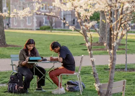
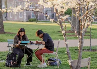
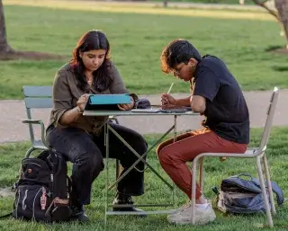
For example, if you crop and make adjustments to a header image on your desktop computer in a browser window that is 1250 pixels wide, you may think that it looks great. However, by making these adjustments the same header image will look different for others
1250 pixels wide:
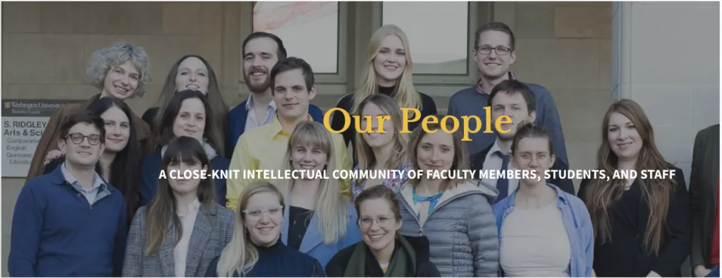
1680 pixels wide:

2400 pixels wide:

How can I avoid this?
A single image will never look perfect on all browser sizes and devices. The goal should be to make it look good for as many people as possible. This means that sometimes you may not be able to use a particular image in certain places. Many times, the only solution might be to choose a different image. These are a few tips for making sure the images you are using are displaying properly on your website:
Don't crop or enlarge your photos
When you enlarge your photos, they will start to pixelate. If you are enlarging your photo because it doesn't meet the minimum size, you will get better results from using an alternate photo than trying to enlarge the one you have.
Make sure you have a large margin around the subject of the photo
The A&S web theme automatically crops your photos after you upload them to the website. If you crop it before you upload it, it will cause all of your photos to be super close up and look bad on certain screen or device sizes.
Use the focus tool
The focus took works by 'shifting' the photo so that a certain area is centered. If you are using a photo that is only the minimum size, the focus tool won't have any room to make that shift. Using a larger than minimum photo will allow that focus tool a larger area to make that adjustment.
Choose a photo that is oriented correctly
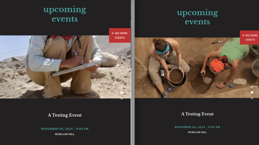
If the heads of people in your images are getting cut off, this is likely why. When adding photos, keep in mind how and where the photo will display. If the space that the photo will appear in is landscape-oriented, don't use a portrait-oriented photo. If the photo area is portrait-oriented, don't use a landscape-oriented photo.
For example, if you wanted to promote an event to the Events and Two Articles section on the home page, the image in that section always displays landscape-oriented. This is what that section looks like if you correctly use a landscape-oriented image (right) versus an incorrect portrait-oriented image (left):
